With all the recent hype about mobile optimisation and responsive websites it’s easy to get caught up in the frenzy, but what does it all mean for your business and what should you do?
Q: With so many devices which one should you optimise your website for?
A: all of them
What is mobile optimisation?
Mobile optimisation is about creating websites that work well on mobile devices. That’s not one mobile device like an iPad or a Galaxy smartphone; it is every device and every screen size that exits now and that will exist. Now that seems like a pretty tall order, and it would be if we were to create different websites for every device. But there is a simple answer: responsive websites. Responsive was a term coined by the web developer Ethan Marcotte, which basically means websites that adapt to the size of the screen they are being viewed on.
This is not the only method of mobile optimisation but it is the method that we recommend to our clients because it’s easy to maintain, cost effective and most importantly loved by Google. Why is it cost effective? Well it is only one website so there’s only one set of content to update. The websites architecture adapts this content to suit the mobile device that it’s viewed on.
Why you should make your site mobile optimised
There are three reasons why you should consider making your website responsive.
The first reason goes back to the basics of the marketing mix or 4Ps, which is about putting the right product, at the right place with the right promotion at the right time. The place element in this mix is online, what’s changed is how users get online. Even if your business doesn’t transact online the initial place potential clients are engaged and converted is online. Mobile optimisation is about tailoring your potential customers experience online to the device they use.
The second reason: Mobile device usage is on the increase. In B2C markets mobile device usage has seen a huge increase, in B2B markets it’s slower but there is still an increasing trend.

The third reason is that as of April 21st Google updated its search algorithm to favour websites optimised for mobile devices in its mobile search results.
Is your website mobile friendly?
The best way to find out is to take the test. Follow the link below to Google and input your website’s address.
> Is your website mobile friendly?
How do you make your site mobile optimised?
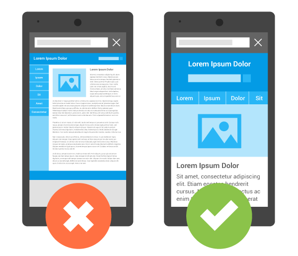
Mobile optimisation as a term is a bit deceptive. You could be fooled into thinking that it means making a few subtle tweaks to your website so that it works better on mobile devices. But in reality what it actually means is creating a website that is tailored to the mobile device it is being viewed on, which is more than a few tweaks.
For most businesses with desktop websites, mobile optimisation really means rebuilding your website and reconsidering how your business information is displayed.
Here to help

Picture courtesy of Google