With over 1 billion active websites online, how do you make sure that it’s your website that people click on.
Q. What makes a user choose your website over your competitors?
Q. What makes them click on a link or download that whitepaper?
The answers to these questions all lie in user behaviour analysis. Knowing your potential customers and how they research and source products and services like yours is the key to getting your site right.
But there are however some quick techniques that you can implement to have an immediate impact on your websites ‘clickability’. Below I’ve detailed 5 easy website design tips that will grab attention and get your visitors clicking again.
What makes you click? 5 easy website design tips to grab attention
1. Attention grabbing headlines
We’re all familiar with tabloid headlines, but have you ever really considered the role they play and how good they are. In 2 to 3 seconds a news headline grabs your attention and draws you towards the article it’s promoting. The most effective ones are short, snappy and infectious, which is exactly what your website’s page titles need to be. Your advantage over the media is that you’ve also got an additional 155 characters to explain what you’re offering.
As I wrote this in the office I was discussing potential titles with those nearby and one colleague shouted, “try, ‘It’s all in the detail’ that would work” and while it sounded great, would it have made you click and read this article? The answer is probably not, which is why it didn’t make the cut. Always ask yourself, “would that make me click?”.
When you search for any product or service you’ll be presented with a series of search results like those listed below. This is where your copy needs to shine.
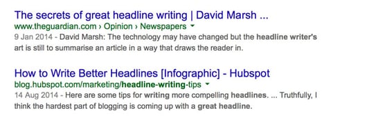
Which headline grabs your attention the most?
Make your page titles no more than 70 characters and make them enticing to the reader. Copy that is intriguing or that entices the reader to want more will attract far more clicks than a descriptive page title. We call this clickbait.
The same applies to your meta description (the two lines that appear below your title in search results). Rather than just a description of what the page is about, use the meta description as advertising space for your page. Use words that prompt an action in your potential visitor like ‘discover’, ‘see how’ or ‘watch this.
Writing an attention-grabbing headline isn’t easy, but if you do it well you’ll stand in a sea of search results.
2. Great Images
Imagery is one of the most powerful forms of communication online. Yet so many businesses resort to hackneyed stock photography that adds little value to their website pages. If budgets allow commission custom photography for your brand and consider innovative photo treatments like mono images with a single colour element or aged photo treatments like those provided by Instagram.
Great photography is a proven way of increasing user engagement which is why posts with images on Facebook and Twitter get 53% more likes that standard text posts SOURCE: HubSpot.
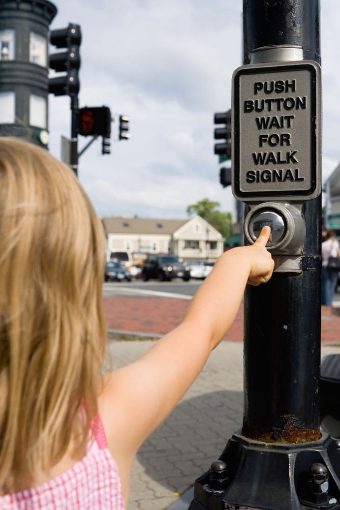
3. Big Green Buttons
It sounds strange but big green buttons on your website work. Why? It’s all about ease of use and familiarity. Users naturally act on the things they know and trust.
Green in informational graphics and signs means go. So many websites feature red and black buttons. Visually this is really striking but subliminally those buttons are saying ‘stop’, ‘go no further’.
When I say big, I mean bigger than you usually see. A 10% increase in button size makes that website element stand out from the surrounding content.
4. Clear calls to action
Take an existing page on your website that has a button or call to action, squint your eyes and give yourself three seconds to find it with your mouse. Be honest, if it’s easy to find then it’s the right size if you experience any difficulty then it’s probably too small. If your button is at the bottom of the page e.g. below a shopping basket consider moving it up the page. If it’s easy to find and easy to use then by definition you’ll get more clicks.
As with the advertising style page titles, be creative and engaging with your calls to action. Try statements like ‘Register Now’ or ‘Discover how’, ‘Grab your Free guide’ or ‘Let’s talk’ instead of the traditional ‘Submit’ or ‘Send’.
5. Easy to read content
We encourage all ours client to have a minimum of 500 words for their webpages, which makes for good content rich websites. But to get users to read this content and click on a call to action or complete a form, this information needs to be easy to digest.
Order your information in a hierarchy, with your most important content at the top of the page. Begin your page with a summary of what’s to follow. Most users skip through content so a summary is a good way of giving them a flavour of your page without them having to read it all. If the summary gives them the information they seek, they’ll read on down the page.
Break up content in to paragraphs and use sub heads to identify key sections. Bullet points, pull-out quotes and charts all help make content digestible and help your user on that journey through to the all-important click. If you have a form or button that takes a user onto another page, clearly label that button and describe where it will take them. It’s surprising how many users don’t like surprises.
Final thought
These are just a few website design tips that will help you get more get more click throughs, more form submissions and more enquiries. The key is to make small changes, often. Measure the effect your changes have and record what does and doesn’t work. Test and test again. The websites that adapt and change to suit user behaviour are the ones that almost always make the most conversions.